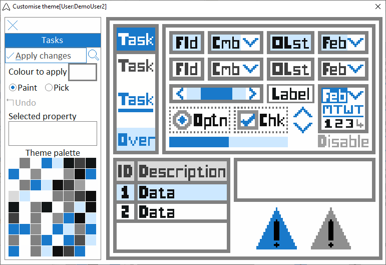
In the Navigator, click on a theme image and then click the Customise… option from the menu.
Choosing a colour
There are 3 ways to select a colour
-
Select a colour in the Colour to apply box by clicking on it and selecting a standard or custom colour from the system palette.
-
Click on a colour in the Theme palette. The “Selected property” label will indicate which property you have selected.
-
If you are currently in Paint mode, select the Pick option. Click on the main theme image to pick the underlying colour. The “Selected property” label will indicate which property you have selected.
The eyedropper cursor indicates you are in Pick mode.
Pick mode is automatic over the Theme palette and the Colour to apply box.
Once you select a colour, the Paint option is automatically enabled.
Change colour property of an item
If you are currently in Pick mode, select the Paint option.
Click on the main image to change to the colour displayed in the Colour to apply box. The “Selected property” label will indicate which property you have selected.
The paint bucket cursor indicates you are in Paint mode.
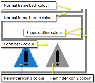
The following colours cannot be changed
-
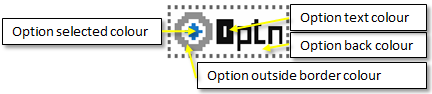
Dashed/dotted box around the Option(Optn).
-
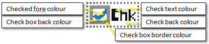
Dashed/dotted box around the Check(Chk).
-
Exclamation mark inside the reminder icons.
Undo. You can undo the last colour change.
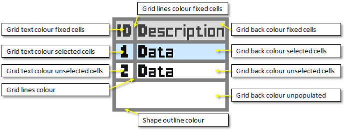
It is highly recommended that “Grid back colour unselected cells” (i.e. the back colour used to display data) is specified as white or a very light colour.
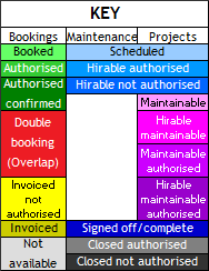
The “key” colours may conflict with customised grid colours in your theme.
If you select colours too close to the key colours, you will be notified!
The key colours are not validated if you apply the current windows theme (see below).
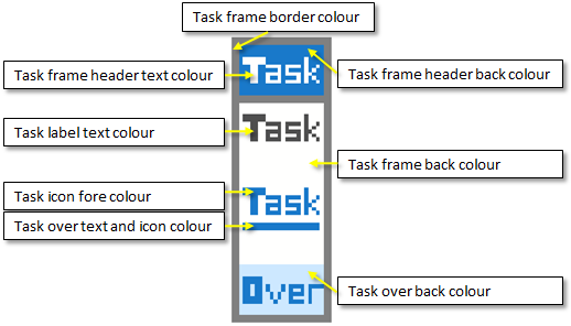
If you enable the Highlight Saturday and/or Highlight Sunday options in the Bookings or Maintenance and Projects modules, the “Task over text and icon colour” is used to highlight the back colour in applicable grids and the fore colour of the row descriptors . Red is used to reflect the date in some of the date selector controls.
Apply changes. Once you apply changes, your custom theme is created or updated and replaces the respective system theme within your profile.
Modules assigned this theme will refresh within the system poller interval as specified in System settings in the Administration module.
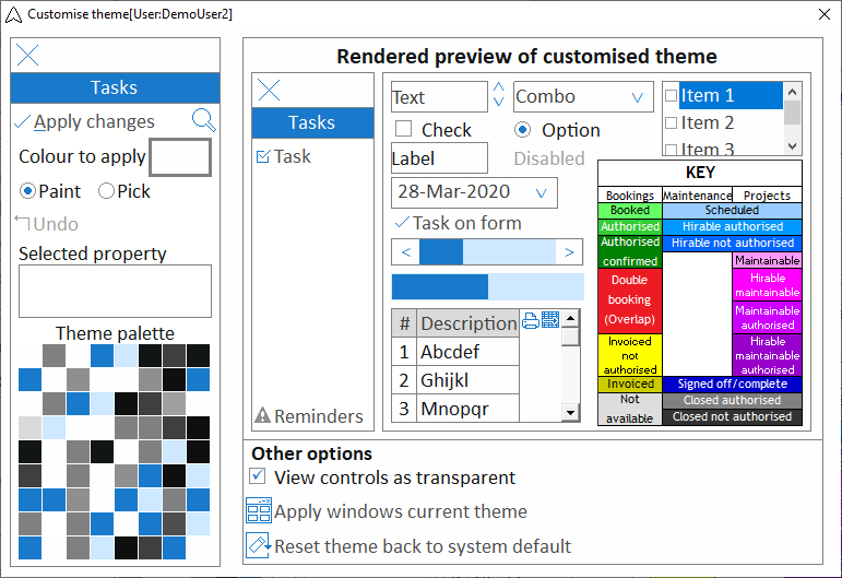
Preview. Use the preview  icon to preview how the controls will appear if you apply the theme changes.
The key is indicated for colour reference purposes.
-
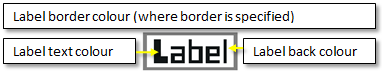
View controls as transparent. Whilst there is a back colour associated with many of the controls, by default most are transparent (i.e. take on the colour of the underlying container).
-
Apply windows current theme. Apply the current Windows theme colours. This only applies to basic and high contrast themes (Aero themes are not supported). 3D visuals are not supported.
-
Reset theme back to system default. To reset a customised theme back to its built-in default, use the Reset theme back to system default option. All customisation for the current theme will be discarded and the customisation form will close.
Select the preview icon again to return to the main image.
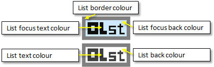
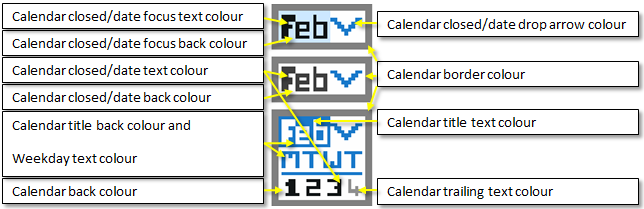
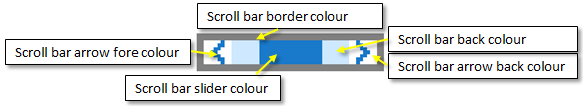
Colour properties
Notes
Controls generally have a non-focus and focus colour schema.
The print  and send to spreadsheet
  icons take on the same colour as the “Grid back colour fixed cells” value.
Visually, the best results will be achieved by setting the “Grid back colour unpopulated” to the same colour as the “Grid back colour fixed cells” colour.
“Task over text and icon colour” is also applied to the underlining of the task text. Be aware that tasks exist throughout the software suite in normal frames, not only task frames and therefore the chosen schema must contrast with both task and normal frame back colour properties.
Where controls have dropdown boxes, the back colour of the drop down box is the same as the back colour of the control when it does not have focus.

